Creating a single voice for help for restaurants
OpenTable had half a dozen different online resources for restaurants to get help with restaurant software. All these resources were created by different departments and had a different look and feel, and voice and tone. As a design driven project, we worked with our training, marketing, and support teams to design a single place to keep all content and to design a better process for content creation and management. As important as the visual and UX design of the new site was, this was even more of a people and process design project.
Research
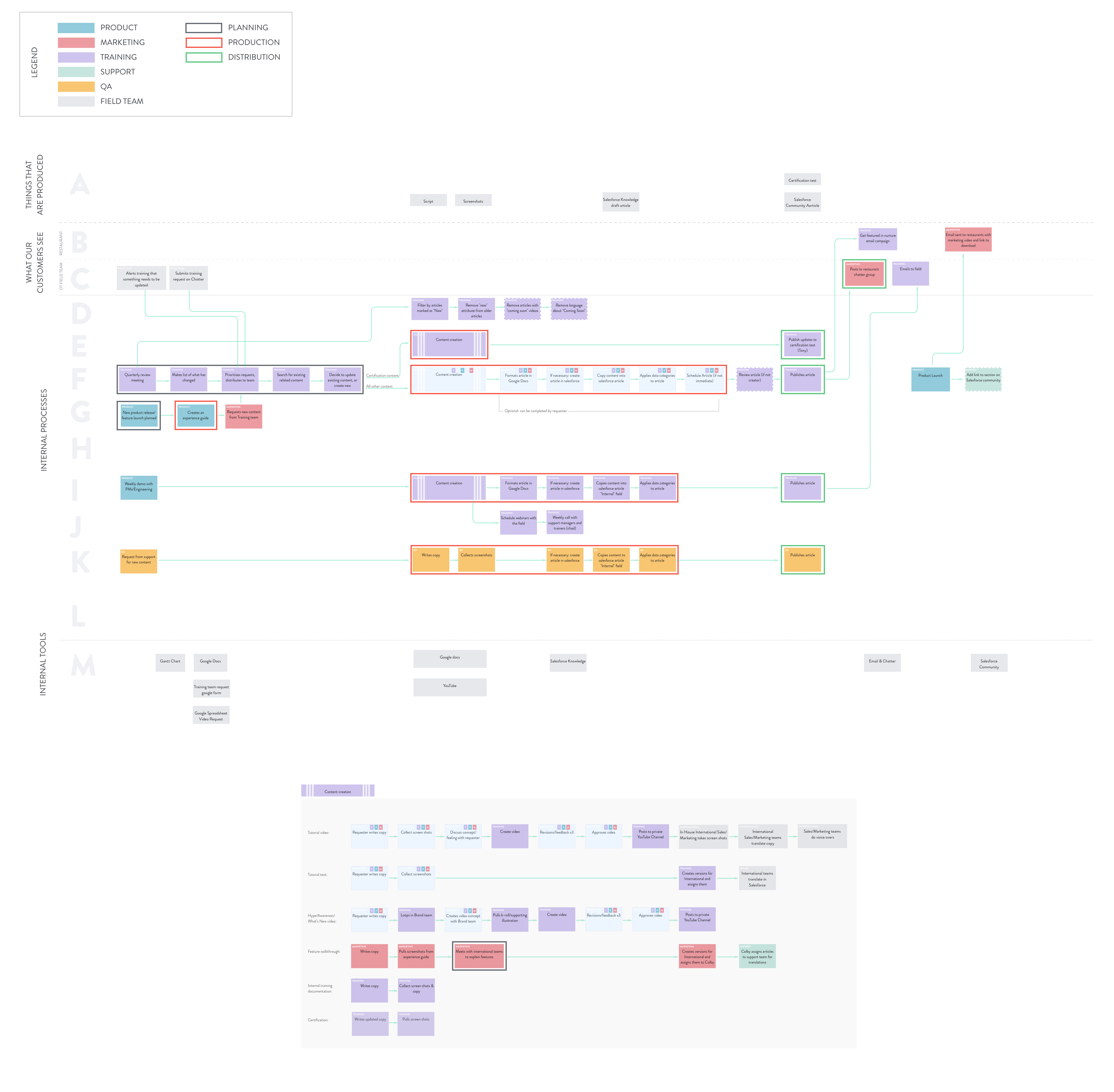
First, we interviewed the different departments that create and manage content to understand where the breakdowns occur. The best way to identify pain-points and to communicate the complex process those involved was to create a service blueprint.
Insights
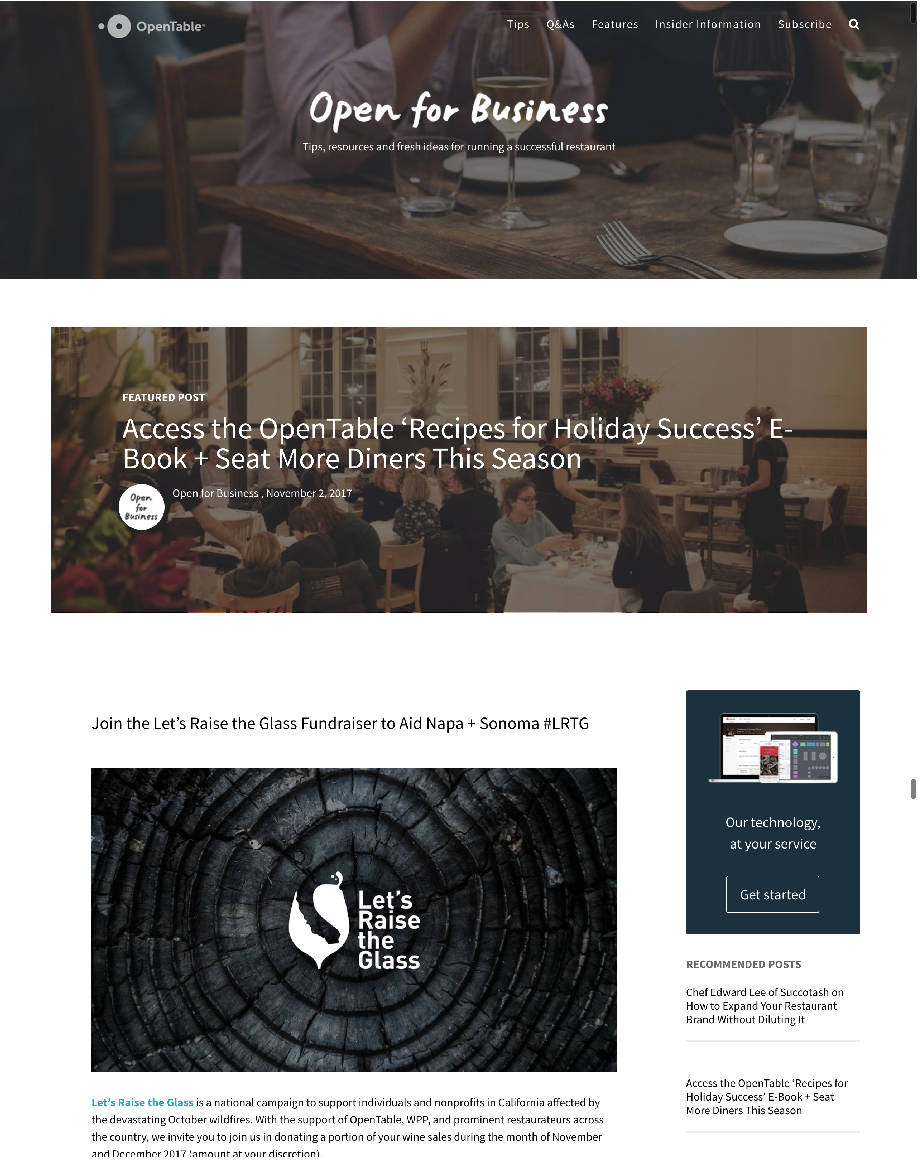
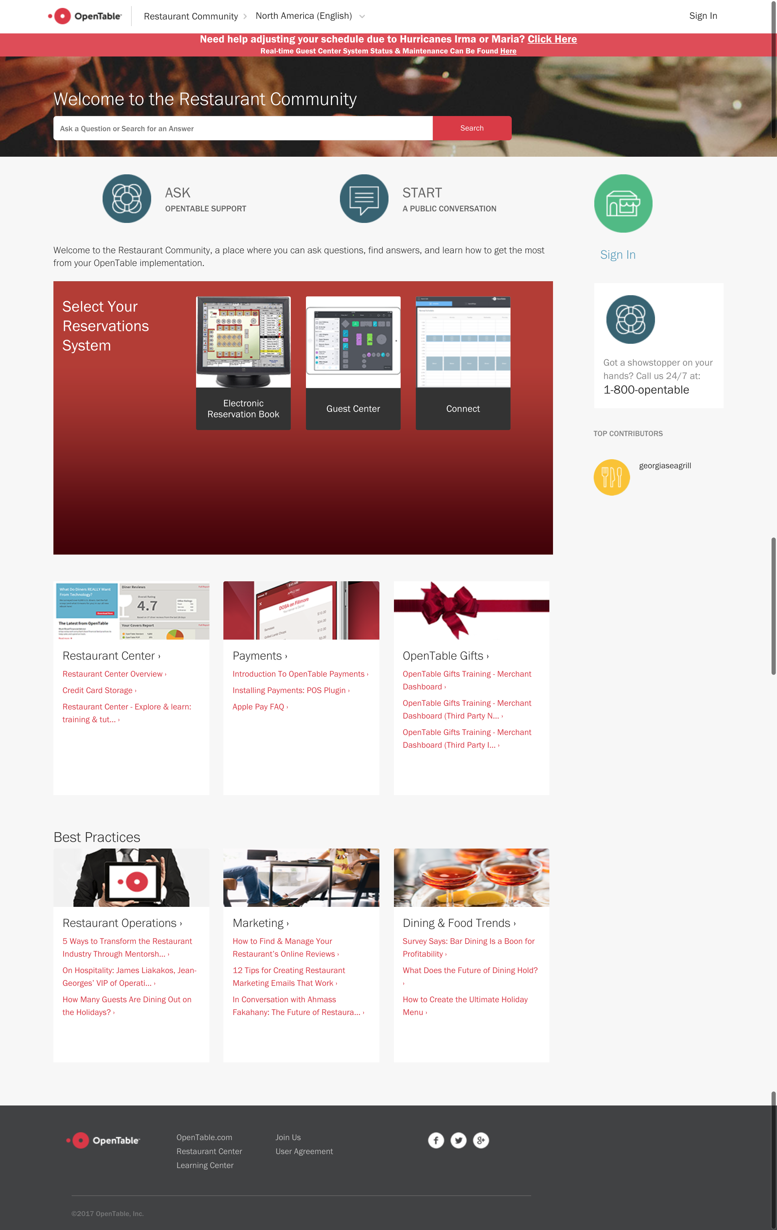
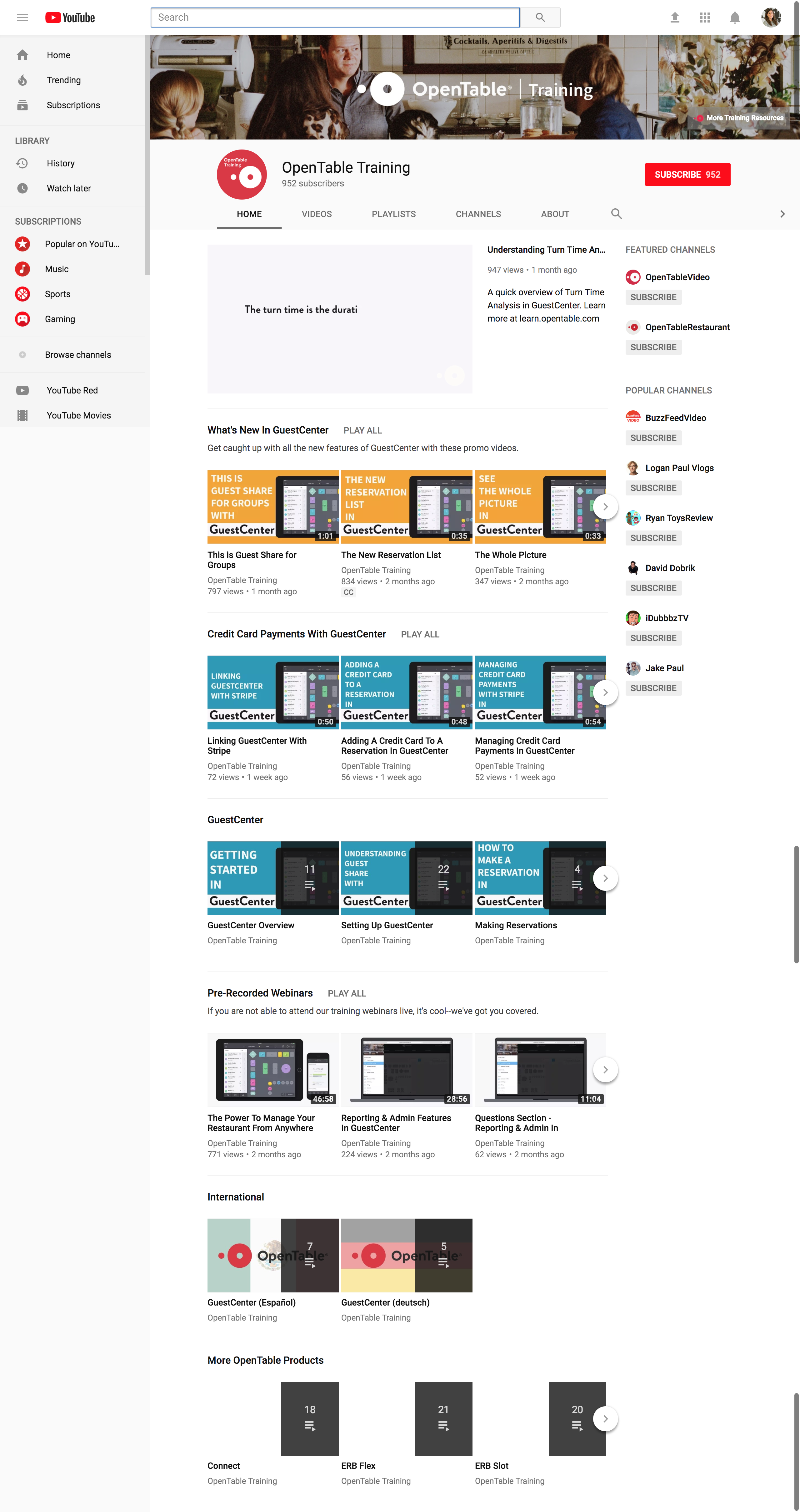
- Over the years, individual teams created their own support channel (youtube, custom sites, etc) because the existing support system wasn't flexible enough or easy enough to use.
- There are a lot of executors, but no one really owned the content after it was created. This is especially problematic when the original content creators leave the company and it's left orphaned online.
- There are a lot of dead-ends because it's easier for content creators to create PDFs and post those as an attachment to a support article. But PDFs can't be translated and can't help a restaurant get to related topics, or back to the home page.
- OpenTable is currently rolling out a new Salesforce Knowledge content management service to replace our existing and outdated Lithium software. Salesforce Knowledge integrates closely with our support team when they take cases over the phone or over email, so it makes sense to build a custom design on top of this platform.
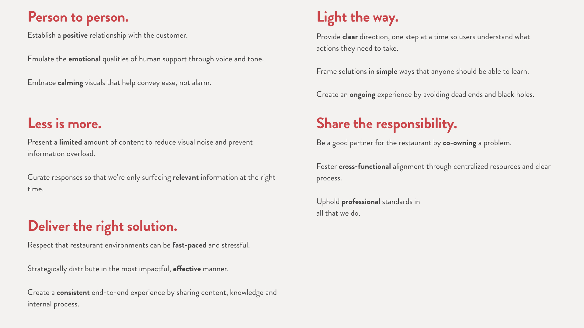
Competitive analysis
We performed a competitive analysis and looked at what other companies do well and poorly within their own support sites. Clustering these attributes helped us identify our product, visual, and voice & tone principles that would guide the direction of the new unified restaurant support site.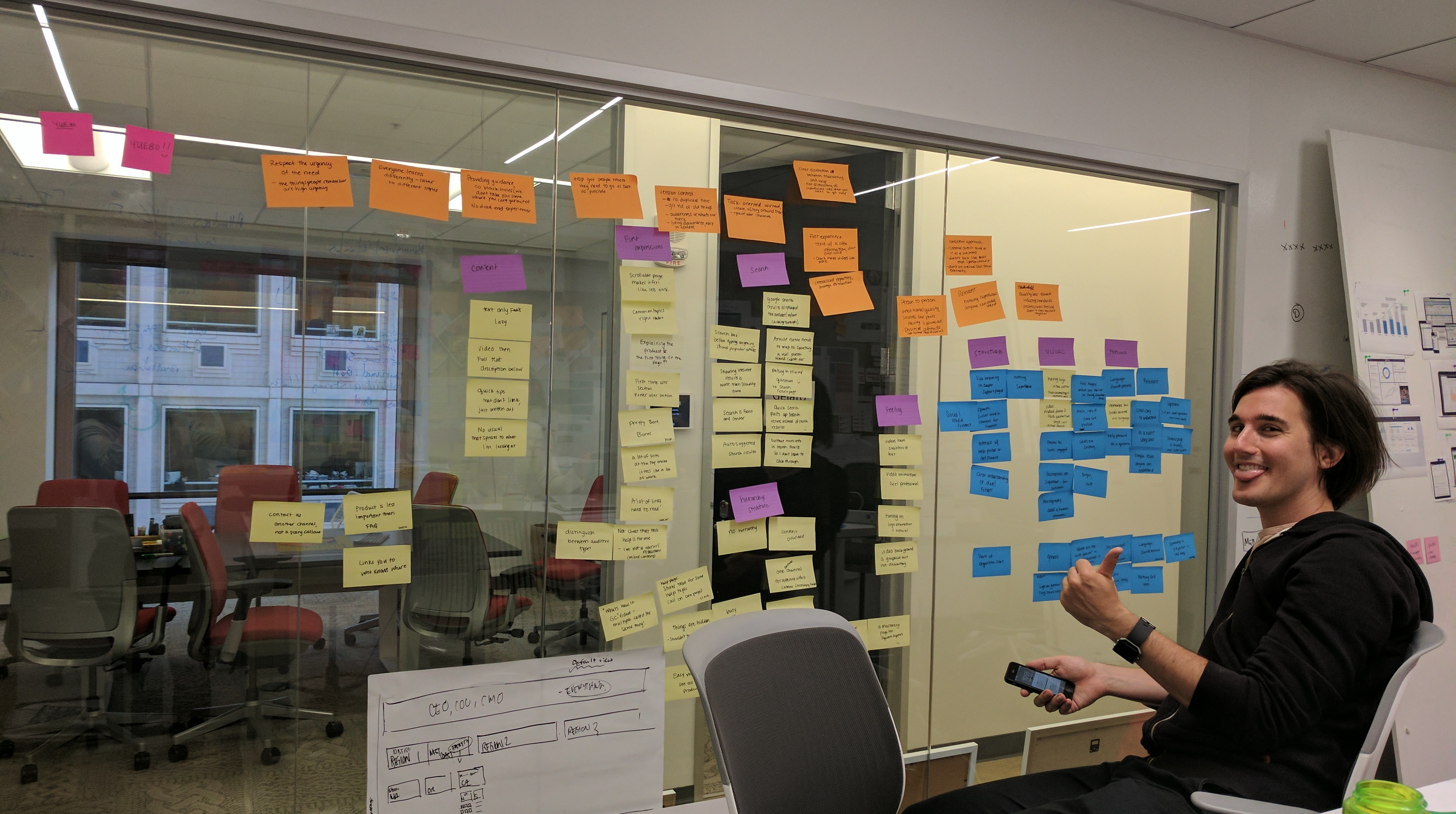
Information architecture
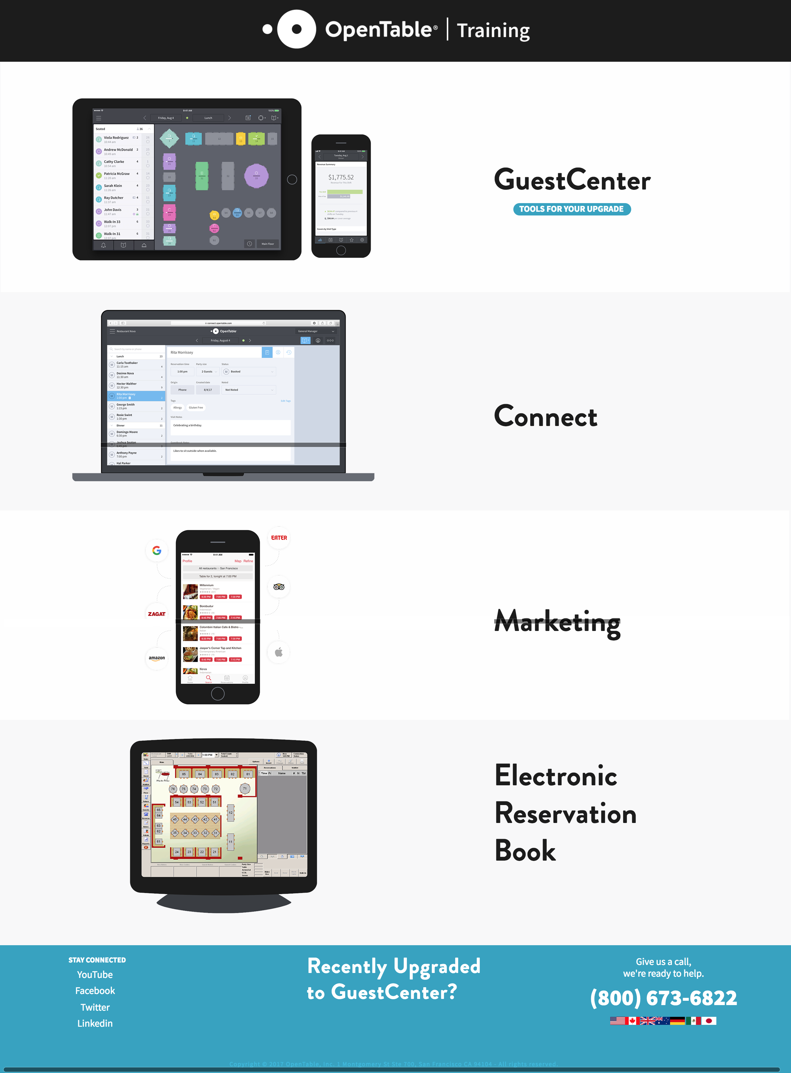
The OpenTable product suite was one of the most challenging aspects of creating the IA of the new support site. There are 3 different product offerings, GuestCenter, Connect, and the Electronic Reservation Book, and most customers don't know the name of the product they use. To restaurants, whatever product they use is just "OpenTable". We had to make sure that even if a user google searches "how to add a reservation in OpenTable", that they would end up on the instructions meant for the product they are using.Solution 1: the IA would be very simple if we put instructions for all 3 products on a single article. This would be better for SEO and it would be a better search experience. However, in addition to 3 products, there are different platforms within those products. A single article with all this information could end up being unmanageable.
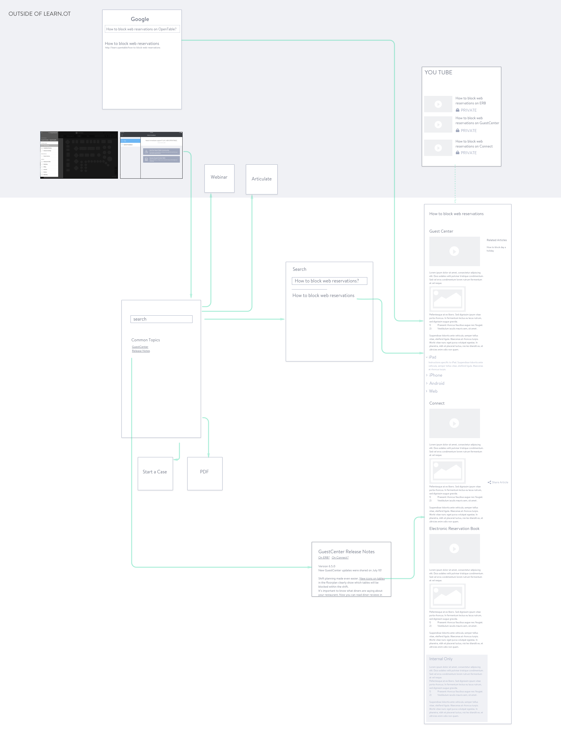
Solution 2: (and the winner) a general OpenTable support page with sub pages for each product. Searching for "how to add a reservation" returns three articles: "how to add a reservation in GuestCenter", "how to add a reservation in Connect", and "how to add a reservation in ERB". Although a search query would be better if it only returned one result for "how to add a reservation", we felt the reduced content is worth the tradeoff.
Moodboards
One of the major goals of this project was to make our support site feel and sound more like OpenTable, so my brand design partner and I worked on concepts that felt reserved and calming, but uses color when necessary to inject personality and help with wayfinding.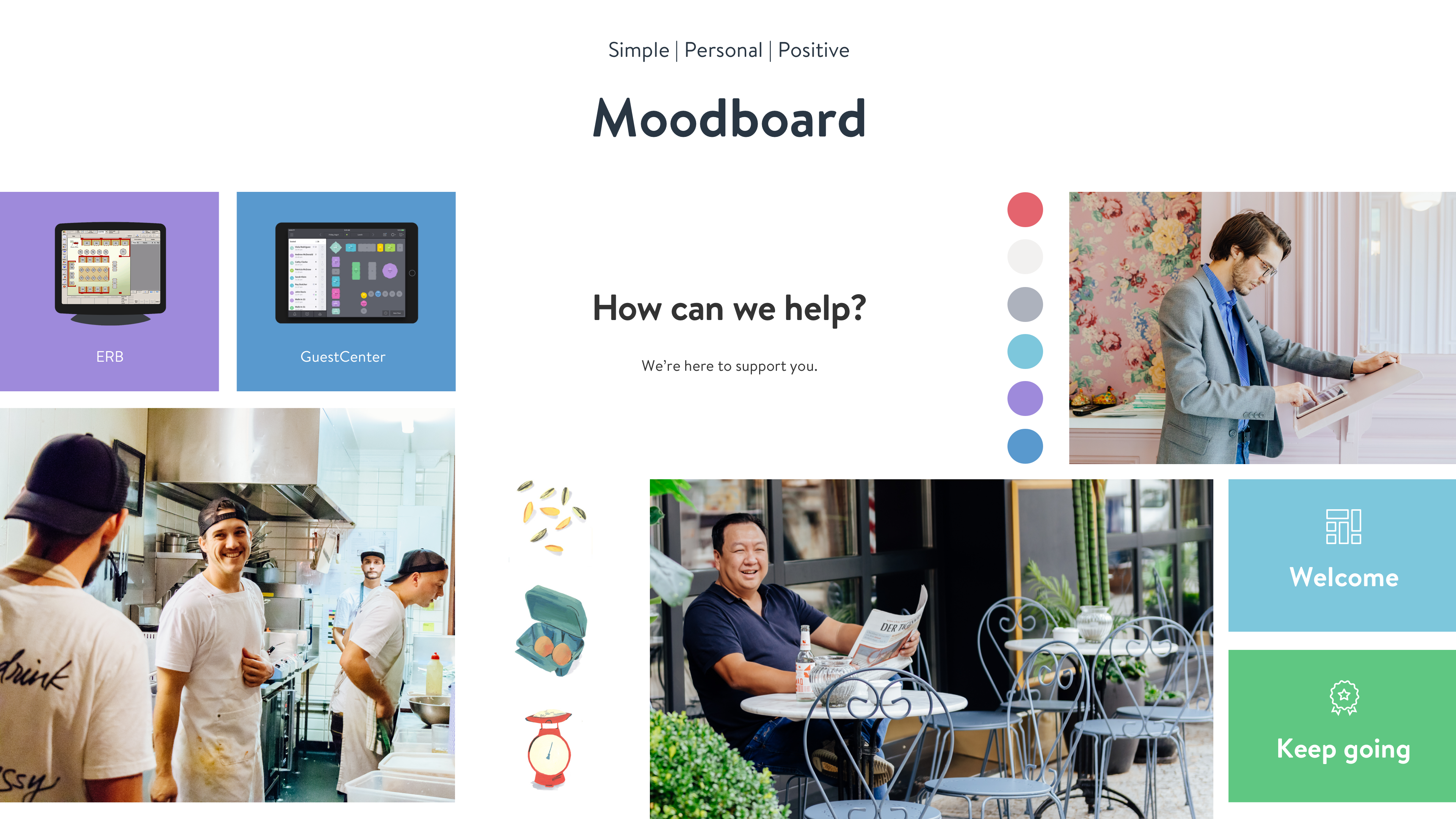
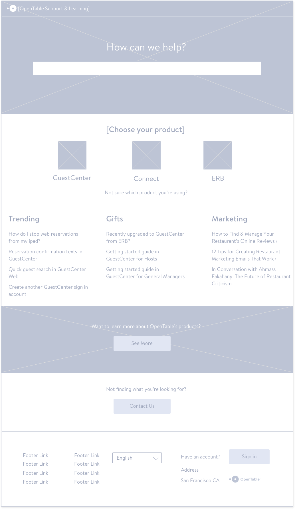
Wireframes
We used wireframes to explore multiple layouts and navigation patterns quickly. Ultimately in this exploration, we thought it was important to keep the product choice as large buttons centered on the page that the user must choose, rather than tabs on the left side so that customers would be more aware of which product documentation they're currently exploring.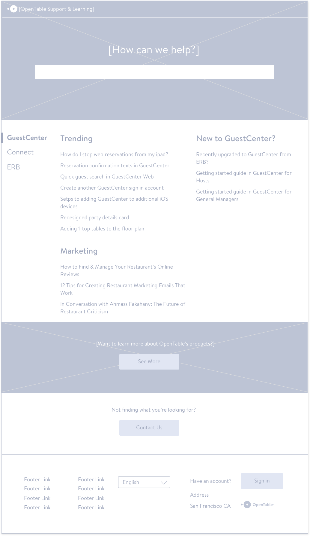
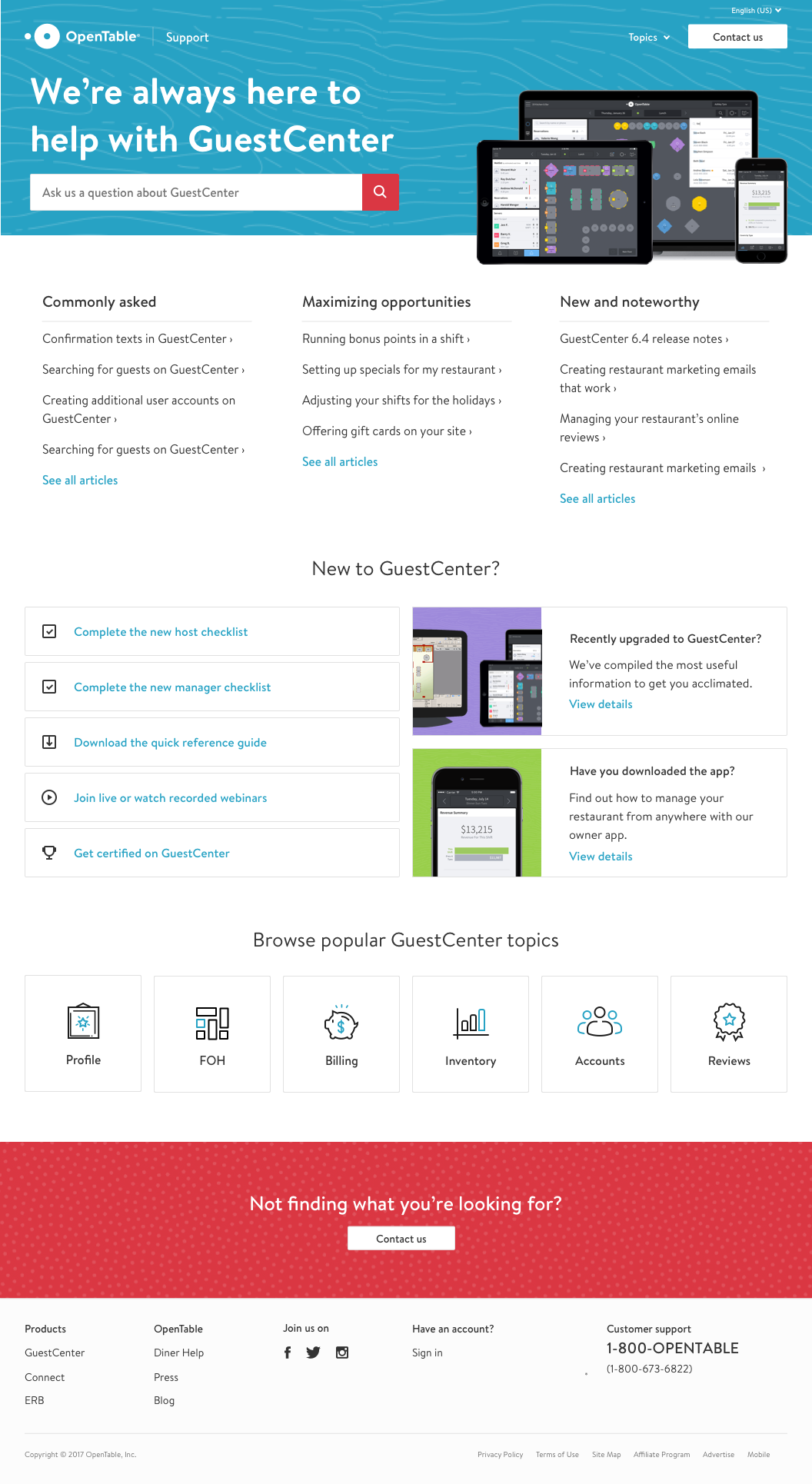
Final designs
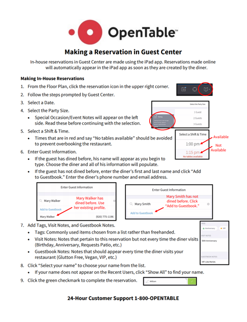
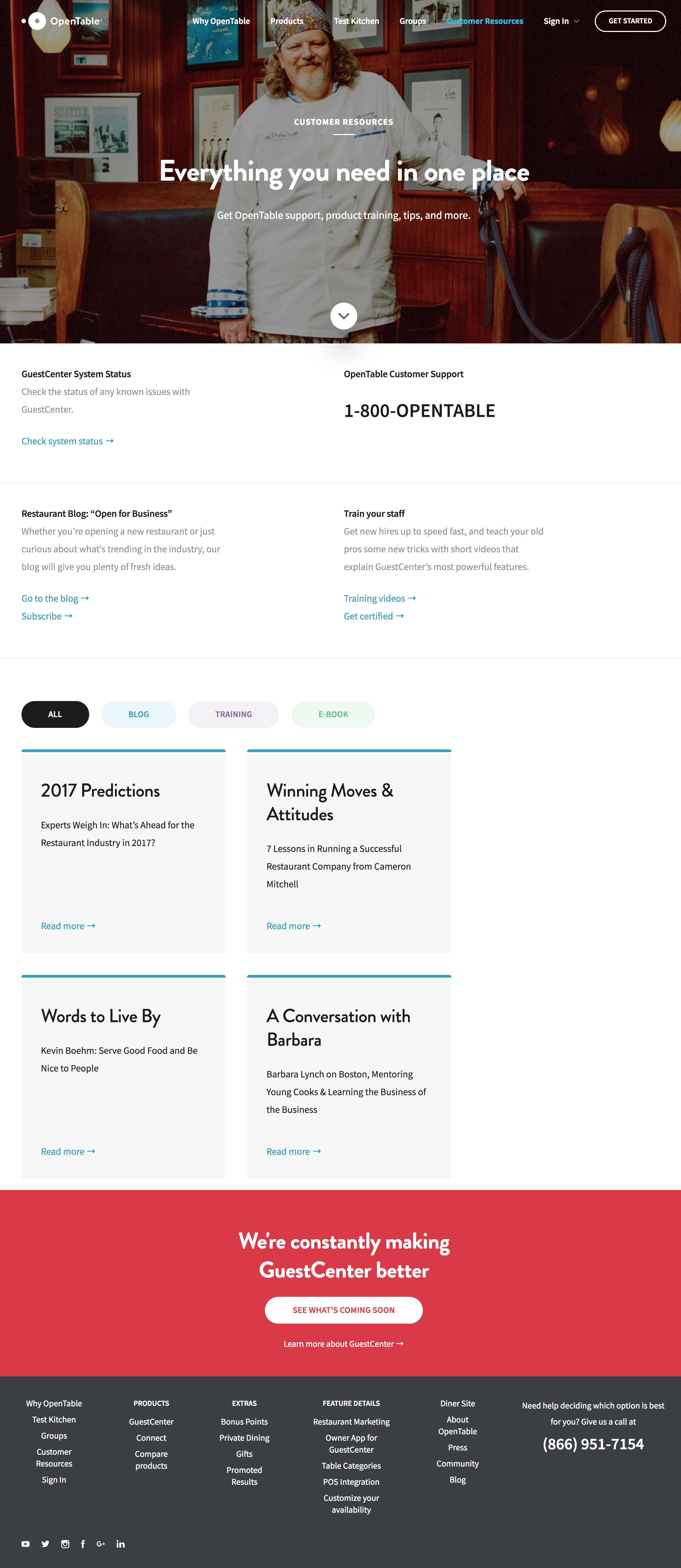
Throughout the design process, we kept in mind that our solution must do everything that our employees do today, but in one cohesive place. As we designed the final mocks, we included examples of how the training team could use articles in the new platform to replicate some of their existing tools, like YouTube video playlists and listicle style pages.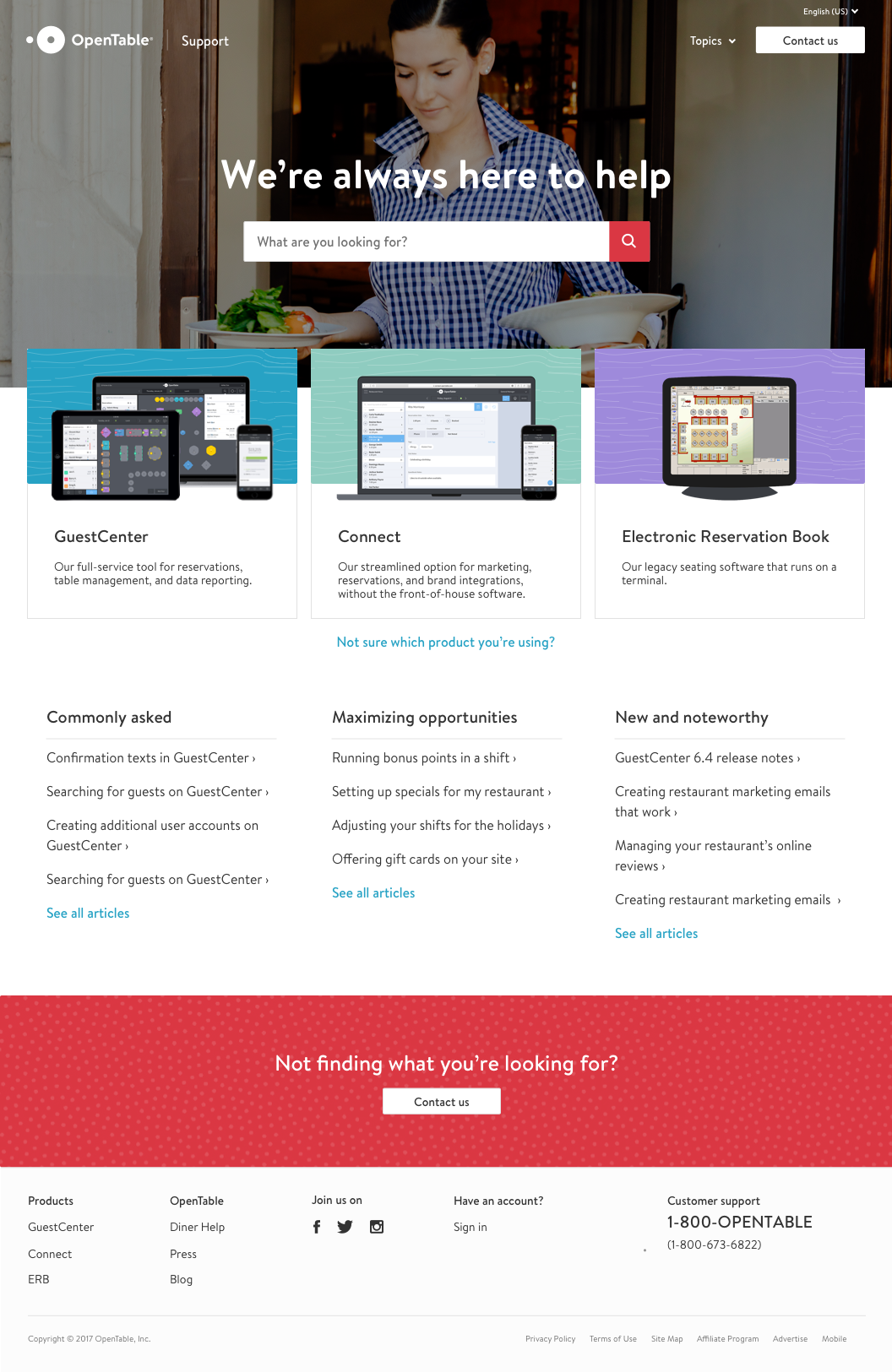
Updated service blueprint
Finally, we redesigned our service blueprint to reflect a recommended new process. To address ownership, we worked with the OpenTable Training team (who creates most of the content) to create a plan where they become the gatekeepers of what ultimately gets published. This will help them be aware of what is going out (very important so they can catch if there is a duplicate topic) and feel ownership over deprecating and managing existing content.